Building a 34 Key Keyboard Layout

Over the past year and a half, I have been using an Ergodox EZ keyboard and loving every minute of it. It does have a downside tough. As a 60% keyboard lover, it is quite large. So, I have been on the look out for a smaller, split keyboard (I can’t go back to non-split), that I can travel with and use for a portable setup. During this research, I was introduced to 34-36 key split layouts, but wasn’t sure if I could manage one. To test out the idea, I decided experiment with new layouts on my Ergodox…
Background Concepts
Before digging into layout design, lets establish a few key concepts we’ll need to understand for the keyboard layout.
Layers

First, lets start with layers. This is something you are probably already
familiar with, as most people use keyboard layers every day without realizing
it. Your smartphone’s software keyboard likely has a small layout that utilizes
layers. For example, my iPhone has a base layer containing the letters of the
alphabet, along with a space bar, shift, backspace, enter, and… yep, layer toggle
keys! If you want to use numbers or symbols, you tap the 123 key, and iOS switches
to the number layer which contains number keys along with some symbols. From
here you can use whatever symbols you need, hit ABC to return to the base
layer, or tap the #+= key to enter another layer with even more symbols.
Keyboard layers are something we have all become accustomed to. They allow us to use many more keys than a keyboard physically has. With only 34 keys to work with, good use of layers is required for my layout. While toggling layers on a phone is obnoxious and can be annoying, I have found that the task isn’t nearly as bad on a physical keyboard, especially if it has thumb keys.
Tap vs. Holds
The next, but likely first new concept to learn is how key taps differ
from holds. In qmk (the open source keyboard firmware), tapping
and holding a key can execute different functionality. For
example, you can set the Caps Lock key to work as normal when tapped, but
function as a CTRL when you press and hold it for a set period of time. I
already use this feature on the Ergodox, so it was a conept I’m already familiar
and comfortable with.
Home Row modifiers
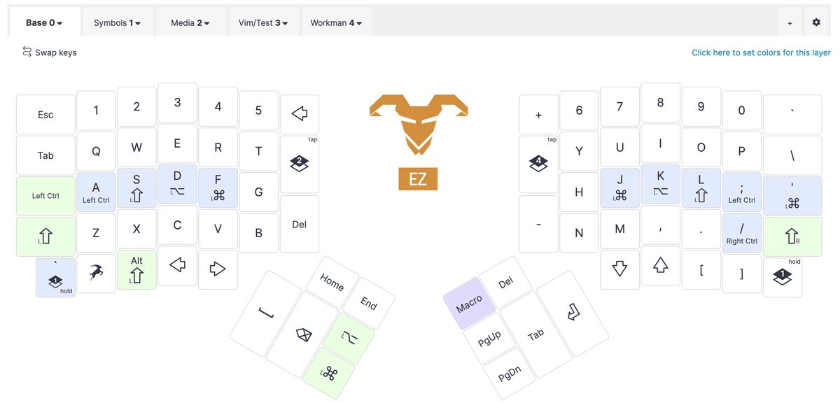
Above all else, what got me realizing that I might actually pull off a 34 key
layout, were home row modifiers. Home row mods are when the home row keys
(ASDF and JKL; on a QWERTY layout) are used for keyboard modifiers
(Control, Shift, Alt/Opt, and Windows/CMD/Super). This can be
accomplished using several methods. For example, using tap/holds, the home row
keys can function as they normally when tapped, but then double as a modifier
when held (ex: a when taped, but CTRL when held). Or, these keys might just be
defined as modifiers on a non-base layer, like a symbol layer.
For someone that uses a bunch of keyboard shortcuts, this is a game changer.
It’s taking the practice of setting the Caps Lock key to a useful modifer (I
always set mine to CTRL), and turning it up to a whole new level.
I started my experimentation by adding home row ‘hold’ modifiers to my
normal Ergodox layout, just to try it out for a few days. I knew that if I
couldn’t adjust to home row mods, there was no way I would be able handle a 30-something
key keyboard. To my surprise, I adapted to it much quicker than I had expected.
After taking some additional time to test different orders of the modifiers, I
think I’ve settled on (Control, Shift, Alt/Opt, CMD/Super) for now.
Switching to home row mods showed me that not only was a smaller layout possible, but that I might end up preferring it.
Creating the Layout
After adopting home row mods, I felt comfortable enough to try a 34 key split layout. I started by editing several modified layouts I found online from other people.
Layer Toggle Setup
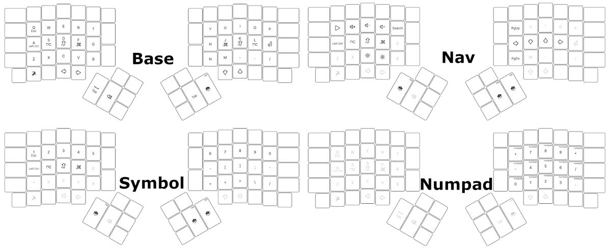
Influenced by a popular video on 34 key layouts, I started with a toggle layer switching scheme. If I tapped a thumb key, it would switch to another layer, and remain there until I hit a key to switch to a different layer.
This setup worked okay, but I had a real hard time with the layer switching. I just couldn’t flow nicely while typing. In addition, the rest of the layout wasn’t very well thought out, based on how I use my keyboard. Despite these issues, spending time with this setup did help me iron out my pain points for my future revision.
Callum Layout
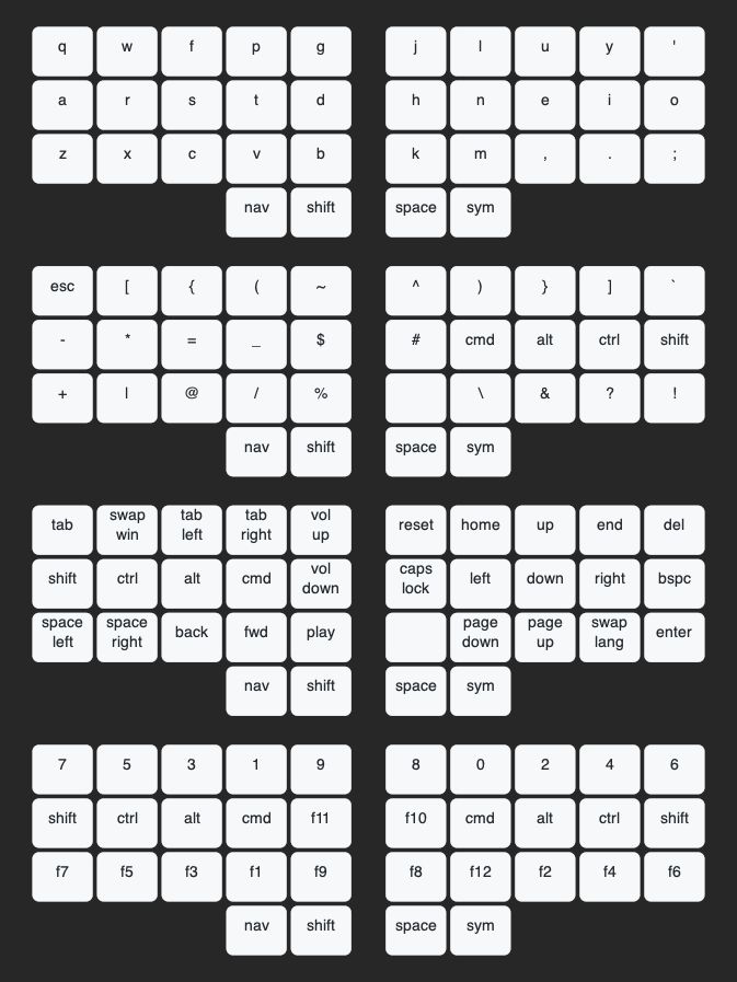
While struggling with my first design, I continued to do research. Eventually, I found some references to the Callum Layout and decided to try it with my own spin.
The Callum approach handles layers a little bit differently, opting to instead toggle layers using key holds. Rather than tapping a key and locking on a new layer (like CAPs lock), the keyboard switches to the new layer as long as that layer’s key is held (like SHIFT). So, holding a left thumb key switches to the navigation layer, holding a right hand thumb key switches to the symbol layer, and holding both activates a number layer. This method works surprisingly well. It might sound like you need to be an octopus to use the number layer, but because the layers are controlled using thumb keys, all of your typical keyboard fingers are still available. This layer switching technique worked much better than the toggles for me.
Another reason the Callum layout functions so well is that it allocates home row modifiers on each layer. Specifically, the home row contains normal modifiers that can be tapped or held (well sort of, more on that in the next section). Whichever hand is holding the layer key, is the side that the modifiers are on, leaving the whole other half available for most of the layer’s keys (except the number layer, which has modifiers on both sides). This helps you efficiently use both of your hands.
Lastly, the Callum layout enables me to easily use modifiers in other layers,
which I use all the time for navigation shortcuts (ex: CTRL/CMD + -> to
shift workspaces, or CTRL/CMD + NUM to switch browser tabs).
One Shot Modifiers
However, note that the original Callum arrangement doesn’t include home row
modifiers on the base layer (not even holds). So, you might be wondering “how
are the most basic keyboard shortcuts like copy/paste (usually CMD/CTRL+c and
CMD/CTRL+p respectively) accomplished with this configuration?!”
Modifiers are still available on the base layer using something called One Shot
Modifiers. One shot mods function most of the time as normal modifiers (you can
tap or hold them like any other ctrl or shift key), but if you tap them
without pressing any other keys, it will be queued up to be used with whatever
key is pressed next, even if that key is on a different layer. So, if I wanted
to use CTRL-c in the Callumn layout, I could tap and let go of the NAV and
CTRL keys, which will then return to the base layout. From there, I hit c on
the keyboard, and it’s effectively a CTRL-C. It’s not as complicated as it
sounds, but it does take getting used to for every day typing.
My Layout
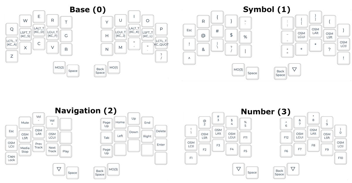
For my layout, I used the Callum design as my base and modified it to better fit my preferences. Here are some of my choices and alterations:
-
I used One Shot Modifiers on my additional layers, but also added home row modifiers (hold keys) to the base layer, as I find it’s just easier to work with.
-
I choose to use
SpaceandBackspacefor my two non-layer thumb keys. I tried others likeShiftandTab, but I really had a hard time transitioning from my old Ergodox layout without a dedicatedbackspacekey. -
I set my
Enterkey to under my pinky on the navigation layer, again because this was hard for me to adapt to it anywhere else. (This also dictated that I use an ‘upside down T’ arrow key layout instead of VIM-style) -
I
TABa lot, so when I couldn’t have it as a dedicated thumb key, I set it to a pointer finger key that’s easy to remember and ergonomically comfortable. -
As a programmer, I configured the various bracket pairs to be accessible and easy to remember. I made
[]the easiest to use because I mostly code in python and write notes in obsidian, which both extensively use square brackets. -
For most of the remaining symbols, I placed them on the opposite hand’s home row, but in the same order they are on a normal keyboard’s number row, so it’s easier to remember (ex:
!,@,#…). For the few symbols that extend beyond the 5 keys (excluding()because they’re already defined elsewhere), I just continued the order in the next row. -
For numbers, I learned I actually preferred a number row over a number pad in this type of layout. The top row is not hard to reach, now that I only have to extend my fingers up one row. Additionally, giving that the layout is only 10 keys wide, it’s easy to locate each number. I just count my fingers. This setup also made it easy to incorporate the function keys in the same layer in a meaningful order.
Most of the other keys (but not all) were also thoughtfully placed in the layout, but it’s not worth rambling on any more about each one.
Issues/Future Improvements
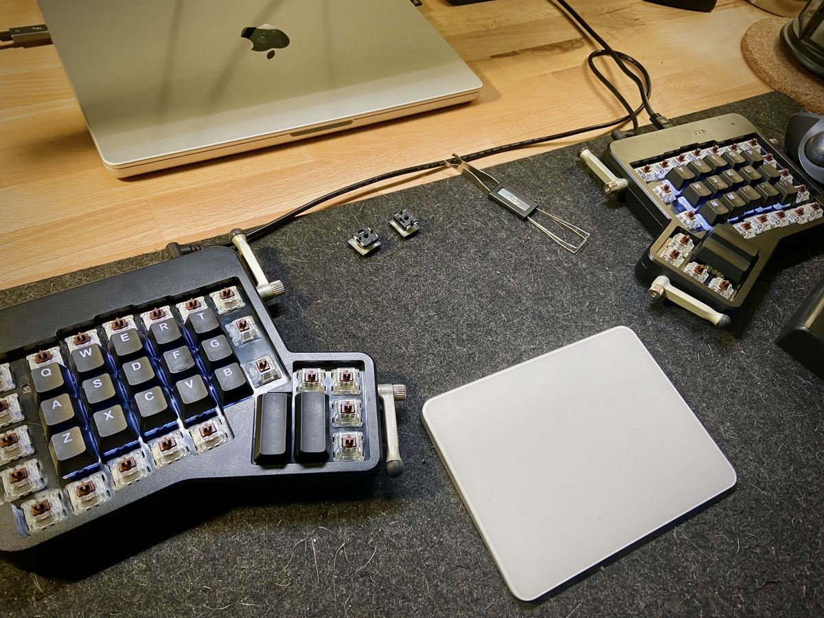
While the layout works great for me most of the time, there are a few issues and areas I’d like to improve over time:
Some common symbol locations aren’t ideal - I said that most, but not all of the symbol locations were well thought out. Over time, I would like to find better locations for symbols that I use a lot, but don’t feel right while using this layout. For example, ~ and ;.
Bad for gaming - The home row mod’s mean that I can’t hold 3 out of 4 ‘WASD’ keys… so that’s problem. I’m thinking that I might be able to add a gaming layer at some point that I can toggle into when playing games.
I’m not able to do some actions one handed - I can do a few tasks like change the volume with only one hand, but many of my navigation shortcuts require two now. This could be worked around if I really did some usage analysis and thought about it. For now it’s not too much of an issue. Just something to think about improving in the future.
Conclusion
I guess I should cut it here before this post gets any longer. I am not done
tweaking my 34 key layout, and probably won’t be for some time, as I want to
keep learning more about my options using qmk. However, using the Ergodox with
34 keys over the last few weeks has provided me with the confidence needed to
take the plunge and order parts to build a 34 key split keyboard. But more on
that later!