Re-enabled Contrast Accessibility Settings on my Apple Devices

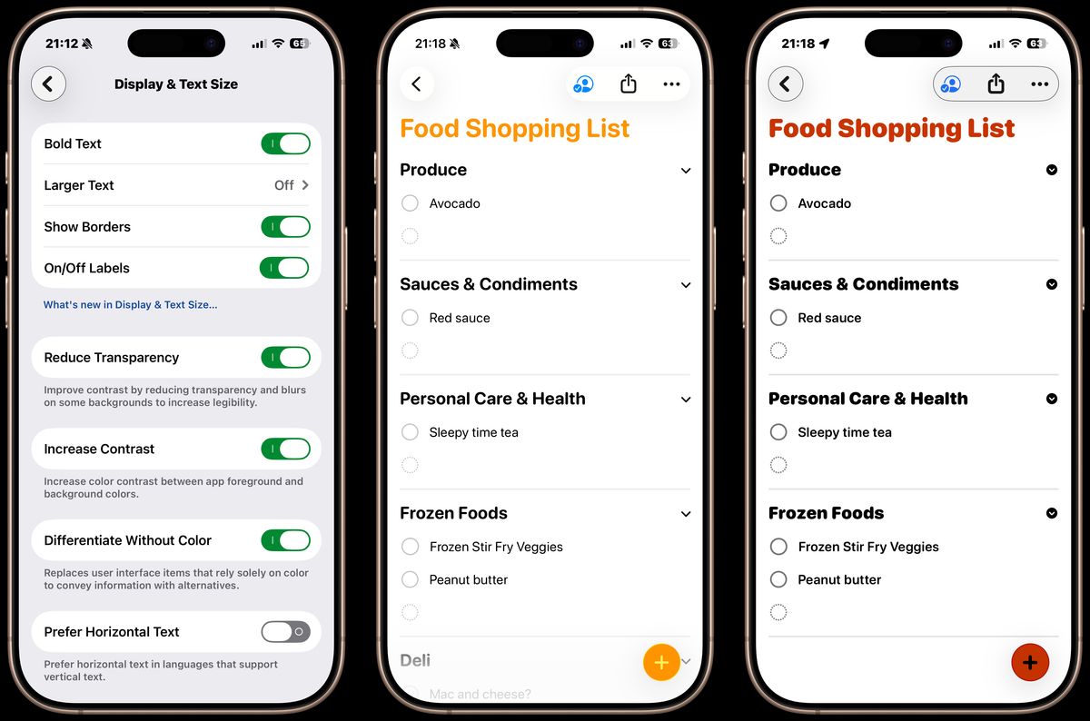
Two weeks ago, I switched on some of the display accessibility settings. Specifically, I enabled the ones that focus on increasing contrast and readability:
- Bold Text
- Larger Text
- Show Borders
- On/Off Labels
- Reduce Transparency
- Increase Contrast
- Differentiate Without Color
Background
This isn’t my first time using these settings. I previously enabled them, probably around the time I was dabbling with e-ink devices and was used to seeing blunt contrast in app UIs. However, I disabled the settings last year while coding the front-end of PerspectivePixels, and thought I was experiencing bugs only on my devices as a result of the settings (my phone looked different from the simulator and my wife’s phone XD ).
Afterward, I kept default settings during *OS 26 beta and release cycles which contained the initial liquid glass implementation, so that I could follow the progress.
Why Switch Back
So why switch back now? Basically, I’ve given liquid glass a good amount of time, but think I’ve had enough of it for now. To be clear, I’m not one of those people who think it’s ‘the absolute worst thing Apple has ever done!’. Beyond the visibility issues, it does look… cool?.. pretty?
However, it represents a design progression that is moving in the complete opposite direction from where I am. I’ve always loved simplicity and contrast, and recently have started to double down on those aspects by dabbling with Neobrutalism design for my website and my in-progress apps. Over time, my appreciation for readability, high contrast, and simplicity in applications has only increased, even at the expense of ‘beauty’.
The Switch
On a whim one day, I toggled on the accessibility settings on my MacBook. However, not long after that I had them enabled on all my Apple devices. Once it was set up, I immediately wanted it enabled whenever I switched to a device without the settings. It’s not perfect, and by all accounts ‘uglier’ than the default settings, but I much prefer it for my UIs.
To try it out, go to Settings -> Accessibility -> Display & Text Size and play around with the different options. Over time, I ended up using most of them.
Conclusion
I just wanted to share a small but very satisfying change I’ve gone back to recently. It might not be for everyone… but I enjoy it. Try it out if you never have, especially if liquid glass isn’t your thing.