Website Switched to Hugo

In my last post, I stated that within a few days, I would officially generate and publish the website using Hugo. I then proceeded to publish that post using Hugo. Close enough. If I remember correctly, I ended that post listing off a few tasks that I wanted to complete before switching the site (oops). Well… they’re complete now. Here’s how.
Create Single Pages (About/Homelab)
This wasn’t so hard to do once setup, but it took a little while for me to get to that point. I was unaware that I needed to configure a layout for the pages, which was the source of most of my confusion.
After that realization, I created a new layout directory (in my theme directory) for each of the pages to add: /layouts/about/ and /layouts/homelab/. I then copied the /layouts/post/single.html file into the two directories to use as a template for the two new layouts (/layouts/about/about-page.html and /layouts/homelab/homelab-page.html). The pages only required a basic layout that would inject the .Content from the markdown files. Additionally, I tweaked the header slightly to display an “updated on” date, rather than a “posted on” date.
With the templates made, I constructed a new /content/pages/ category, and added about.md and homelab.md files to it. In both files, I defined the type and layout parameters, so that the new layouts would be used. Lastly, I used the menu parameter to declare that each page would be part of the main menu.
---
title: About
date: 2017-08-28T09:51:18-04:00
type: about
menu :
  main:
    weight: -150
layout: about-page
image: img/header-images/park-books.jpg
---
Setting up an RSS Feed
It turns out that Hugo ships with its own RSS 2.0 template by default. When I first saw this, I thought that I may still have to dash off a layout or markdown page for the feed, but even that was unnecessary. Each “content” section (ex: post or pages) has an RSS automatically generated at /section-name/index.rss. I don’t need a feed for my static pages, so I just found the feed for my posts. To make it easily accessible, I added a menu link. Without a defined markdown file for the rss feed page, I needed another way to add to the navigation menu. I accomplished this by adding the following code to the bottom of my config.toml file:
[[menu.main]]
  name = "RSS"
  url = "/post/index.xml"
  weight = 0
This is how both the Home and Archives links were already been added to the navigation bar by default in the theme. I just added another item for the RSS link, and adjusted the weight to have it to show up at the end of the menu. That was it.
Check how the posts display
One task I needed to complete was going through and editing each post. The main issue that requiring a fix, which I explained in the previous post, was that the image tags needed to be switched from markdown to html syntax. While I originally planned to set a width=100% parameter for the image tags, I learned that using a max-width: 100%; worked much better for my use-case. I know this can be handled in the overall css file, but I like explicitly defining how to handle each image when I write a post.
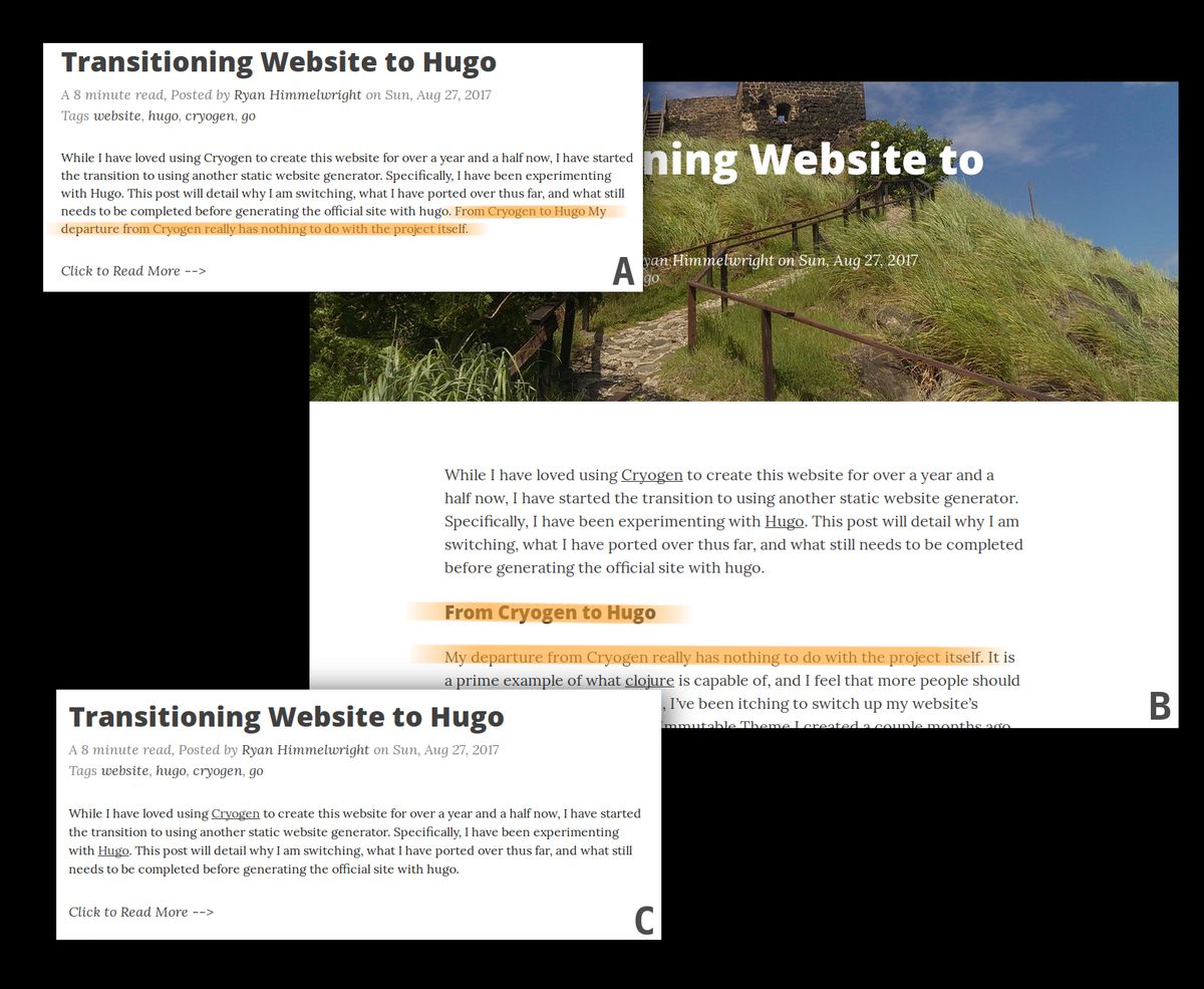
While editing the posts, I noticed that the post summaries weren’t displaying the content that I intended them to. I have hugo configured so that I manually cut off the summary location using a more tag in the markdown.But it didn’t appear to be doing that.

- A: An over-extended post summary.
- B: The extra content of the post that was included in the summary.
- C: The corrected post summary.
Some of the summaries seemed to extend beyond the cutoff point, still including the next section header, and some of the section’s content. After further inspection, I noticed that I had a space on either side of the “more” in the tag. So, I had to go through and delete the extra spaces in each post.
Next/Prev Posts
The main “Small Tweak” that I wanted to figure out was setting up navigation links at the bottom of each post page. I added some code between the and tags of my theme’s /layout/post/single.html file. I first made a section using if statements to establish the “Next Post” and “Prev Post” header line. Then in a second block, I placed the actual links using on the next line using with statements. The if and when statements are required so that previous and next posts are only linked if they exist. So, the first and last post will only display one of the two links.
<!-- Next Post/ Previous Post Links -->

    <div style="float: left; text-decoration: underline; text-align: right;">Next Post:</div>


     <div style="float: right; text-decoration: underline; text-align: right;">Prev Post:</div>


<br>


    <a href="" style="text-align: left; float: left; max-width: 40%;"></a>


    <a href="" style="text-align: right; float: right; max-width: 40%"></a>
Conclusion
I have continued to enjoy using Hugo. The few issues I had with it, keep being quickly dismissed as I learn more about the system. It is simple to use, but at the same time provides an immense level power and control. I will continue tweak the site here and there, but I think for the most part, I can consider the transition complete. Which I am very happy about :).